User Experience Challenges in Skyscanner's Booking Process
📌 PROJECT SCOPE
- Client: Skyscanner – Case Study
- Timeframe: 2 Months
- My role: UX Researcher
- Team: Abril Hernández and Camila Dirán
- Methodology: Qualitative interviews, Secondary Research, Screening Surveys, Competitor Analysis, Usability testing, Affinity Map
- Tools: Figma, Figjam, Dovetail, Maze, Jotform
Overview
Skyscanner is a popular online travel search site that helps users find and book flights, hotels, and car rentals. It’s designed to be easy to use, allowing travelers to compare prices and make quick, informed travel decisions.
Following COVID-19, the airline industry was severely affected, since then it has recovered its profits, it’s estimated that the global forecast of revenue reached in 2023 was $779 billion US dollars compared to $506 billion U.S. Dollars in 2019.
We realized that many users “did not recommend” using the Skyscanner app due to discrepancies in the values displayed.
As a result of this research, we believe Skyscanner can achieve higher revenues and improve the overall user experience during the flight booking process.
My role in this project involved conducting primary and secondary research to understand the user’s pain points. We follow up the Design Thinking methodology.
🚀 PROBLEM
In the competitive world of online travel, user experience is key to a platform’s success. Despite Skyscanner’s wide range of travel options, many users leave the booking process before completing it. That’s where our research comes in.
🔎 OBJECTIVES
Understand user’s pain points when they book a flight
Assess the usability and user experience of the mobile app
Identify areas for improvement to enhance user satisfaction and conversion rates in the flight booking process
Competitive Analysis
🏅 Benchmarking
The Process
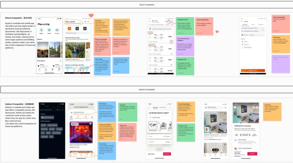
- As part of our investigation, we conducted indirect and direct competitor research to gain valuable insights into existing patterns and experiences.
- Airbnb was our indirect competitor and Kayak was our direct competitor.
- We only focused on the mobile version and evaluated it based on the Usability Heuristics of the booking process.
Direct Competitor – [KAYAK]
- Kayak shows more Clarity and readability related to icons in the top menu and a better interface showing a “price and offers” bigger than Skyscanner, also the accuracy of the fonts.
- Related to Call to action design, Kayak shows more personalize messages during all the user flow and an easy and use interface to book a fly.
Indirect Competitor – [AIRBNB]
Airbnb presents a better visual design, users can navigate and search for different places to visit, but will always have the menu available and visible and the search icon to go back and start again.
Comparing Airbnb with Skyscanner, Airbnb shows more consistent typography but a large font-size change between the title and body to ensure readability. The images matched the text, so it makes sense.
Discovery
👥 Screening Surveys and User Interviews
Methodology
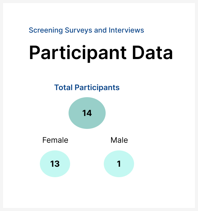
- We launched fourteen screening surveys and selected a diverse group of individuals who varied in their age and who previously used Skyscanner to book a flight.
- We reached five candidates who agreed to participate in an exploratory interview and an usability test.
The Process
- We conducted the interviews online using Google Meet, our sessions lasted 30 minutes per participant, and in the same session, we applied an interview and usability test prototype created in Maze.
- This straightforward prototype was created to find out if the user understood the flow of booking a flight on Skyscanner.
- We chose six tasks for users to do during the usability test.
- Since we were a team of two, we all covered five sessions, one moderating and one session of note-taking.
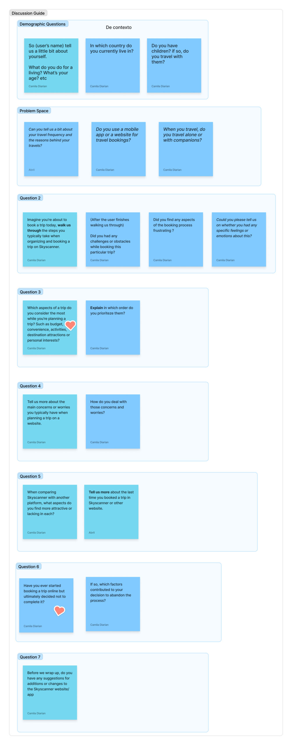
- We created an interview script and recorded all the sessions.

Skyscanner prototype in Figma
Interview Script
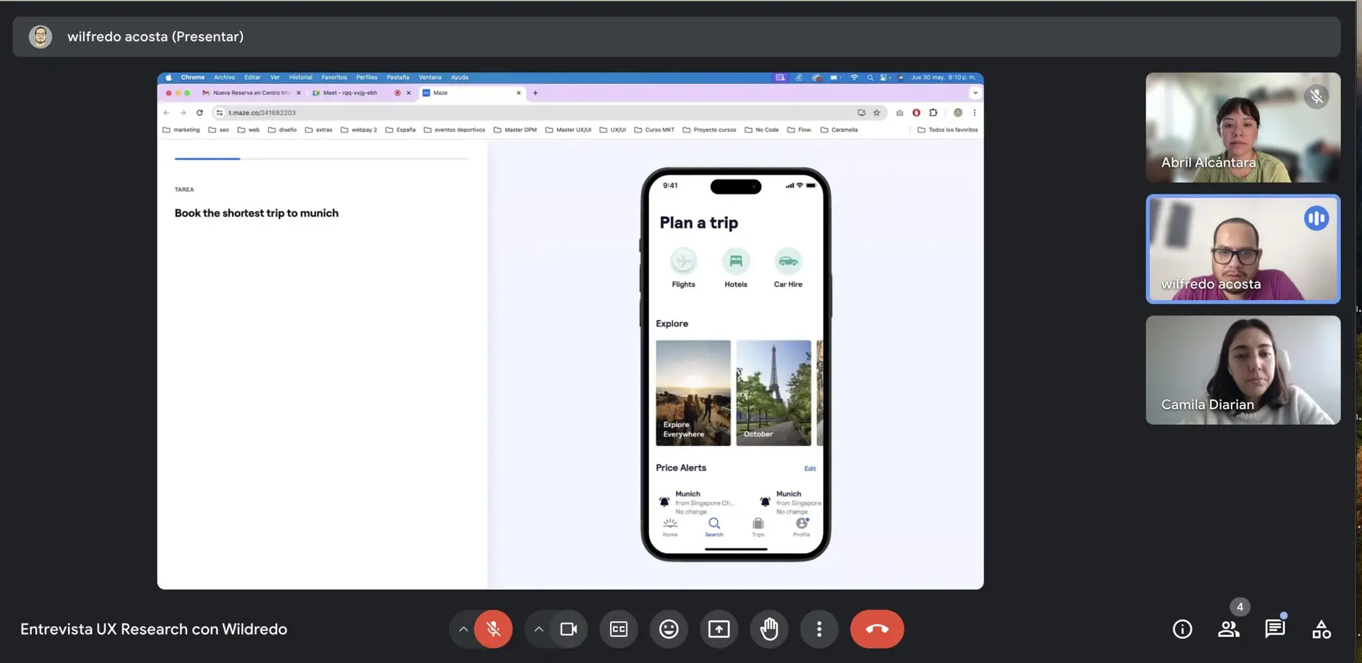
Conducting interviews and usability testing
Affinity Map
🗂️ Dovetail
The Process
Once we collected the information, we analyzed the interviews, synthesized the raw data, and grouped it into five categories.
Within each category, we grouped the data by affinity and relationship. For this process, we used Dovetail to create an affinity map to find patterns.
- After discovering these insights, we created our first suggestions that would later become more polished recommendations for the Skyscanner team.


Data Analysis
📊 The Findings
1. Lack of benefits and discounts compared to other platforms
Users prefer to book flights directly with the airlines because they often offer discounts, making it a cheaper option.


2. Price inconsistencies between the airline website and Skyscanner
Users have reported seeing price differences between Skyscanner and the airline website for the same flight. These unexpected price inconsistencies lead users to abandon the booking process and undermine their trust.
3. Lack of familiarity
We found that users who have used Skyscanner do not complete the booking process because they are not accustomed to its flow, as it is not very well-known in their country.
This can create distrust, which in turn, prevents users from completing the booking process on the site.


4. Distrust of third party platforms
Users expressed some distrust towards those third-party sellers that appear on Skyscanner, preferring instead to book directly with the airlines even if it means paying more.
Also, users are not completing the booking process because they claim to have a poor and inflexible customer service on third party platforms.

5. Lack of specific information needed during the booking process
Some users said that the share option is not available when viewing a travel deal, which means the other person cannot see the flight unless they perform the same search.
Another user mentioned during the usability test that the airline’s name did not appear at the beginning of the flight search which caused distrust. (The airline’s name appears after completing the search.)

Empathy Map
🗺️ Journey Map and User Persona

We summarized the user interview findings in Figma and created an empathy map, highlighting common patterns to gain a deeper understanding of the primary user type and their needs.
Personas were developed after data synthesis of over five interviews.
Paula represents a typical independent person who wants to work and travel simultaneously from anywhere.
- 29–35 years old
- She likes using her computer to search for flights options to visit her family in Colombia and travel with her husband.
- Share her trip options with family members and see popular attractions and activities in a country before traveling.

Recommendations
🌟 Overall Project findings
1. Increase Loyalty Programs and discounts
- This suggests a need for Skyscanner to offer discounts or points for frequent travelers who often search specific routes or airlines, making the rewards feel more personal and valuable.
- Provide users with special bundle discounts if they book flights, hotels, and car rentals together through Skyscanner. This not only encourages more complete trip bookings but also enhances the value for the user.
2. Enhance the precision of price aggregation and strengthening partnerships with airlines
- Strengthen partnerships with airlines to ensure they prioritize providing accurate and timely data to Skyscanner. Collaborating on pricing transparency benefits both parties by improving user trust.
- Communicate clearly on Skyscanner when prices are estimates or if there might be a delay in updates. Offering users a «refresh» option could also ensure they’re seeing the latest prices.
3. Increase Brand Awareness
This suggests a need for Skyscanner to improve its marketing efforts and presence in specific regions for example Colombia, Dominican Republic, Mexico, etc. to increase user adoption and trust.
4. Improve Third-Party Vetting
This suggests strengthen partnerships with reliable third-party platforms and highlight the safety and reliability features of third-party sites.
5. Detailed Airline and Flight Information
Ensure that all necessary information, such as airline names and policies is clearly available during the booking process. Incorporate filters, sharing and comparison tools to help users find flights that meet their specific requirements easily.
